Published Aug 2026
Fleet Analytics on the Dashboard
The Analytics tab — “Analytics Pulse” — shows your key fleet KPIs as trend charts, so you can spot what is moving in the right direction and what needs attention at a glance.
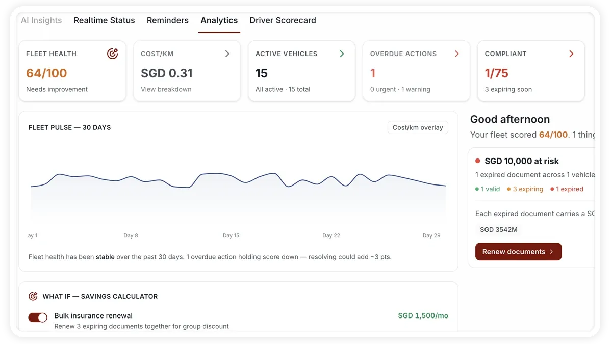
How to use the Analytics tab
- Open the Dashboard.
- Select the Analytics tab (Analytics Pulse).
- Read each KPI chart and its trend over time.
- Use the reference bands to see whether a value sits in a healthy range, and the toggle to change the view.
What the charts show
- Fleet health score — the overall health trend for your fleet.
- Cost per km — how your running cost per kilometre is trending.
- Active vehicle count — how many vehicles are active over time.
- Overdue actions — the trend in outstanding actions that need clearing.
- Compliance signals — compliance trends across the fleet.
- Reference bands & toggle — bands show a healthy range for each metric, and a toggle switches the view.
Frequently asked questions
Where do I find the detailed numbers behind these charts?
The Analytics tab is for spotting trends at a glance. The deeper numbers and breakdowns live in the Reports module.
Related
Next
Calibrate a Vehicle's Odometer
Calibrate a vehicle's odometer against its dashboard reading to sharpen GPS distance and cost-per-km accuracy on the telemetry strip.
Learn more about this feature
Explore featureMore in Dashboard
Didn't find what you needed?Contact support