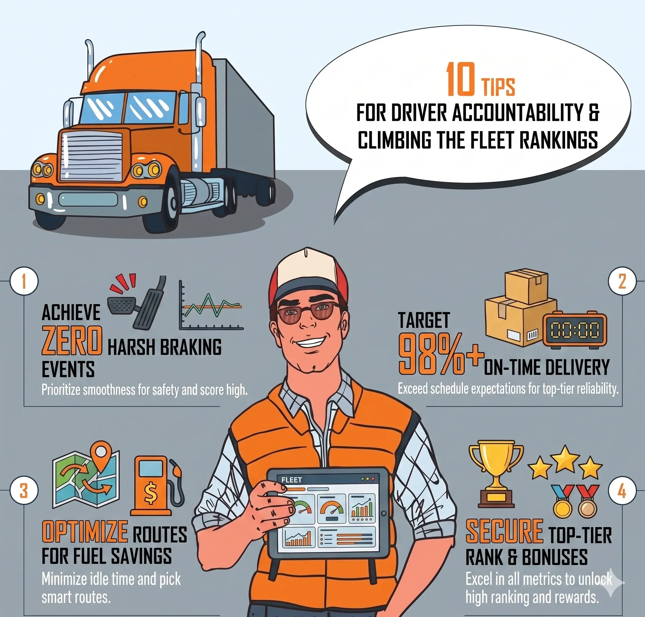
Driver Accountability: How Rankings Build Visibility and Healthy Competition

What You'll Learn
Rankings turn raw driving data into visible, comparable performance. See how safety scores, league tables, and trend tracking build accountability across your fleet.
Best for:
Logistics & Delivery professionals and fleet managers
When every driver knows their performance is measured, visible, and ranked against peers, behaviour shifts. Not because of punishment — because of transparency.
Most fleet managers have the data. Speeding events, idle hours, harsh braking counts, seatbelt violations. The challenge is turning that data into something actionable — something that drives conversations, accountability, and sustained improvement.
That is what driver accountability rankings do. They take raw telemetry and present it as a scored, ranked, trend-tracked system that makes performance impossible to ignore.
The Safety Score — One Number Per Driver
Every driver receives a composite score from 0 to 100, calculated from seven weighted factors.
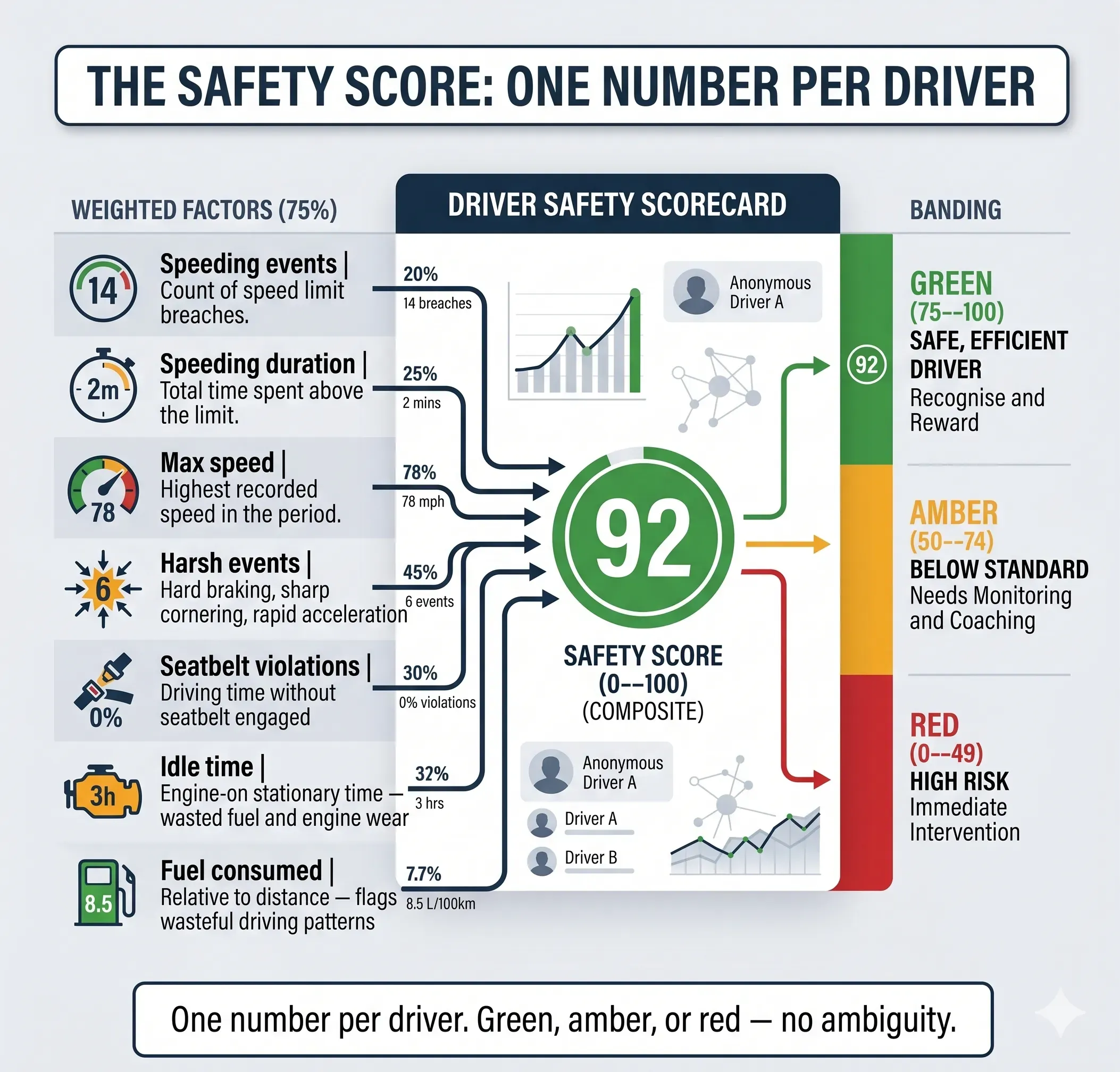
| Factor | What It Measures |
|---|---|
| Speeding events | Count of speed limit breaches |
| Speeding duration | Total time spent above the limit |
| Max speed | Highest recorded speed in the period |
| Harsh events | Hard braking, sharp cornering, rapid acceleration |
| Seatbelt violations | Driving time without seatbelt engaged |
| Idle time | Engine-on stationary time — wasted fuel and engine wear |
| Fuel consumed | Relative to distance — flags wasteful driving patterns |
The score is colour-banded for instant recognition:
- Green (75--100): Safe, efficient driver. Recognise and reward.
- Amber (50--74): Below standard. Needs monitoring and coaching.
- Red (0--49): High risk. Immediate intervention required.
No ambiguity. No arguments about what "good" looks like. The score defines it.
Trend Arrows — Effort, Not Just Outcome
A snapshot score tells you where a driver is. A trend arrow tells you where they are heading.

Each driver row shows a directional trend:
- Improving (green arrow up) — score is rising over the period.
- Stable (grey dash) — no significant change.
- Declining (red arrow down) — score is dropping, needs attention.
This matters more than most managers realise. A driver at 58 with an improving trend is in a completely different conversation than one at 65 who is declining. The first is responding to coaching. The second is slipping despite a higher score.
Trend rewards effort. And effort, when recognised, sustains itself.
League Tables — Worst Offenders at a Glance
The speeding report sidebar includes a driver league card — a ranked list of the top five worst offenders by incident count, broken down by severity.
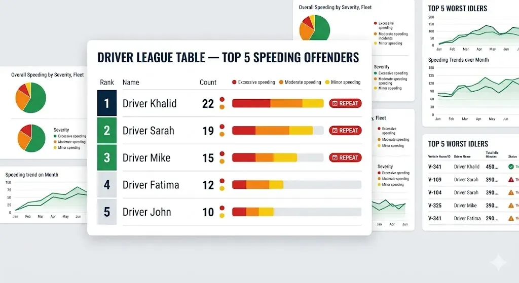
Each entry shows total incidents, a proportional severity bar, and a "Repeat" badge if the driver has five or more events in the period.
The repeat badge is the escalation signal. A single speeding event is a conversation. Five events with a repeat badge is a pattern — and patterns require a different response than one-off mistakes.
The idle time ranking report has its own version: a Top 5 Worst Idlers panel showing vehicle name, driver, total idle minutes, threshold breach indicators, and direct links to the fleet activity report for deeper investigation.
See how AVLView's reporting suite tracks driver behaviour across your fleet
A Real Example
Take Driver Khalid, assigned to Vehicle GCC-4821 in a 45-vehicle distribution fleet.
Week 1 review: Safety score 42 (red). 11 speeding events, 3 harsh braking incidents, idle rate 31%. Ranked #3 worst in the fleet.
The fleet manager shared Khalid's data in a one-on-one. No blame — just the numbers. They agreed on a target: reduce speeding events to under 5 and idle rate below 20% within two weeks.
Week 3 review: Safety score 61 (amber, improving trend). Speeding events down to 4. Idle rate 19%. Rank moved from #3 worst to #18.
The trend arrow showed green — improving. The fleet manager acknowledged the progress in the team meeting. Other drivers noticed.
Month 2: Khalid's score reached 74. Two more weeks and he crossed into green. His idle rate stabilised at 14%.
The cost impact: Khalid's vehicle went from $89/month in estimated idle fuel waste to $38/month — a $51 monthly saving from one driver responding to visible, data-driven accountability.
Multiply that across the eight drivers who were in the red zone at baseline, and the fleet saved over $320/month within two months.
Fleet-Level Visibility
Individual scores matter. But fleet-level patterns tell you whether the problem is individual or systemic.
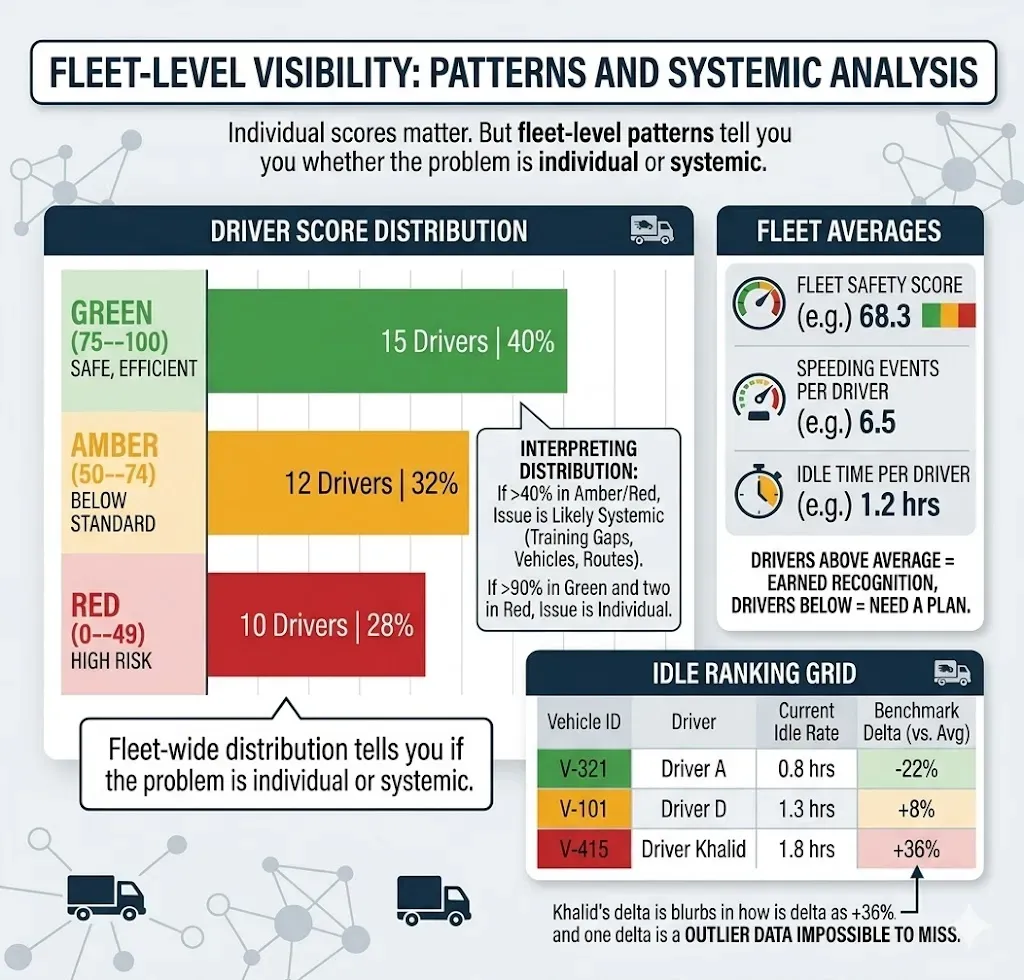
The score distribution chart shows how many drivers fall into each band. If 40% of your fleet is in amber or red, the issue is likely systemic — training gaps, vehicle condition, route design. If 90% are green and two are red, the issue is individual.
The fleet averages panel displays fleet-wide averages for safety score, speeding events per driver, and idle time per driver. Every driver can be measured against these benchmarks. Drivers above average have earned recognition. Those below need a plan.
The benchmark delta column in the idle ranking grid shows each vehicle's idle rate as a percentage above or below the fleet average. A driver sitting at +18% versus the fleet average is an outlier — and the data makes that impossible to miss.
Cross-Report Links — The Full Picture
No single report tells the whole story. AVLView's reports link together so you can build a complete driver profile.
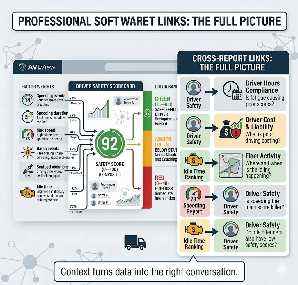
| Starting Report | Linked Report | What It Adds |
|---|---|---|
| Driver Safety | Driver Hours Compliance | Is fatigue causing poor scores? |
| Driver Safety | Driver Cost & Liability | What is poor driving actually costing? |
| Idle Time Ranking | Fleet Activity | Where and when is the idling happening? |
| Speeding Report | Driver Safety | Is speeding the main score killer? |
| Idle Time Ranking | Driver Safety | Do idle offenders also have low safety scores? |
The sidebar in each report includes direct links to related reports for the same driver or vehicle. Use them. A driver with a low safety score and high hours might be fatigued, not careless. A top idler with a green safety score might have a site-specific issue, not a behaviour problem.
Context turns data into the right conversation.
Building a Driver Accountability Programme
Rankings create visibility. But visibility without a process is just noise. Here is a practical framework.
Set Thresholds and Communicate Them
| Metric | Acceptable | Watch | Escalate |
|---|---|---|---|
| Safety score | 75+ | 50--74 | Below 50 |
| Idle rate | Below 15% | 15--30% | Above 30% |
| Speeding events/week | 0--2 | 3--5 | 6+ |
| Harsh events/week | 0--1 | 2--4 | 5+ |
Share these thresholds with every driver before you start reviewing. Accountability requires clear expectations.
Weekly Review Ritual
- Open the driver safety report — filter to the last 7 days.
- Sort by score ascending — identify the bottom five.
- Check trend arrows — separate declining drivers from those already improving.
- Open the idle time ranking — note the top three offenders.
- Cross-reference: are the same names appearing in both reports? Those are your priority interventions.
This takes less than 15 minutes every Monday morning.
Coach With Data, Not Opinions
For drivers in amber or red, show them their specific numbers. Score, events, idle time, rank position. Ask what is driving the numbers — route conditions, vehicle issues, or habits. Agree on a concrete target: "Bring your idle rate from 28% to under 20% by next Friday."
For drivers in green, acknowledge them. Show their rank and trend. Ask what they do differently — peer knowledge transfer is one of the most effective coaching tools available.
Escalation Ladder
| Occurrence | Action |
|---|---|
| 1st time in red zone | Informal coaching conversation with data |
| 2nd consecutive period in red | Formal written discussion, set improvement targets |
| 3rd consecutive period, no improvement | Performance review, consider reassignment |
| Consistent green + improving trend | Recognition: bonus, preferred routes, public acknowledgement |
Track the Fleet Average
The one number that tells you whether your programme is working: fleet average safety score. If it rises month over month, your process is effective. If it flatlines or drops, something is broken.
One AVLView client — a logistics fleet of 80 vehicles in the Gulf — raised their fleet average safety score from 54 to 71 within three months using weekly reviews and structured coaching conversations. Their speeding incidents dropped by 40% in the same period.
Start building driver accountability with AVLView
Common Pitfalls
Ranking without context. A driver ranked worst for idling might be assigned to a route with 45-minute loading waits. Check location data before attributing blame.
Punishing without coaching. Rankings are a conversation starter, not a termination tool. Coach first. Escalate only when coaching fails repeatedly.
Ignoring top performers. If only poor performers get attention, good drivers feel invisible. Recognise your green-band drivers — it sustains motivation better than fear.
Inconsistent follow-through. If you review scores one week and skip the next three, drivers learn the system has no teeth. Consistency matters more than intensity.
All stick, no carrot. Pair accountability with recognition. Preferred route assignments, fuel efficiency bonuses, public leaderboards — these sustain motivation far longer than consequences alone.
FAQ
How is the driver safety score calculated?
The safety score is a composite of speeding events, speeding duration, max speed, harsh events (braking, cornering, acceleration), seatbelt violations, idle time, and fuel consumed relative to distance. Each factor is weighted, producing a score from 0 to 100.
Can drivers see their own rankings?
Yes. Fleet managers can share the driver safety report or post league tables in team meetings. Transparency is part of the accountability process — drivers who see their rank relative to peers are more motivated to improve.
What is a good driver safety score target?
A score of 75 or above (green band) indicates safe, efficient driving. Scores between 50 and 74 (amber) need monitoring, and anything below 50 (red) requires immediate intervention. Track the fleet average over time — a rising average means your programme is working.
How often should I review driver rankings?
Weekly reviews are ideal. A Monday morning check of the bottom five drivers and top five idlers takes under 15 minutes and keeps accountability consistent. Monthly reviews track broader trends and measure programme impact.
Does the ranking account for route differences?
The benchmark delta column compares each driver against the fleet average, which helps normalise for different conditions. However, fleet managers should always check location data before attributing poor scores solely to driver behaviour — loading queues, traffic corridors, and route types all play a role.
Ready to Transform Your Fleet Operations?
See how AVLView helps fleet managers like you cut costs, improve safety, and boost efficiency with real-time GPS tracking.
Frequently Asked Questions
كيف يتم حساب درجة سلامة السائق؟
▼
هل يقدر السائقين يشوفون ترتيبهم؟
▼
ما هي درجة سلامة السائق المستهدفة الجيدة؟
▼
كم مرة لازم أراجع تصنيفات السائقين؟
▼
هل يراعي التصنيف اختلافات المسارات؟
▼
Related Articles

Types of GPS Tracking Devices: Hardwired, OBD, Battery & CAN — Which Fits Your Fleet?
Hardwired, OBD plug-in, battery asset trackers or full CAN telematics — here's how to match each GPS tracker type to each vehicle in your fleet.

How GPS Vehicle Tracking Works: A Simple Guide for Fleet Owners
Follow a single location update from satellite to screen and understand exactly how GPS vehicle tracking works — no engineering degree needed.

GPS Tracking vs Telematics: What's the Difference — and Which Does Your Fleet Need?
GPS tracking answers where your vehicles are. Telematics answers how they're running, burning fuel and being driven. Here's how to choose.
Join 43,000+ Fleet Owners Who Trust AVLView
AVLView helps you:
- Cut fuel costs by 8-15% within 90 days
- Improve driver safety and reduce accidents by 40%
- Get real-time visibility into every vehicle 24/7
- Automate reporting and save 10+ hours per week
- 30-day pilot program with no long-term commitment