Release notes (ver. 9.0.1)
Charts Add-on to Reports Module
Turn data into information. Charts are an excellent way to picturise a lot of data in a format that can quickly digest.
The improved ad-hoc report module has a charts add-on to help visualise reports relevant to any report templates you have created. The visible improvement we did to the reports is generating charts in popular chart types viz., line graphs, bar graphs, pie charts etc.
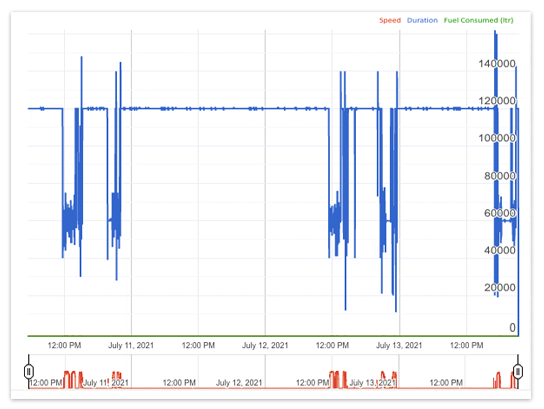
Line graphs are visually impressive that illustrate trends in fleet operational data over a while or of a particular correlation. For example, the graph’s Y-axis might represent fuel level or consumption (variable value), while the X-axis often displays a timeline. Examples of line, bar, column, and pie charts.
Fuel Consumption (Line chart)
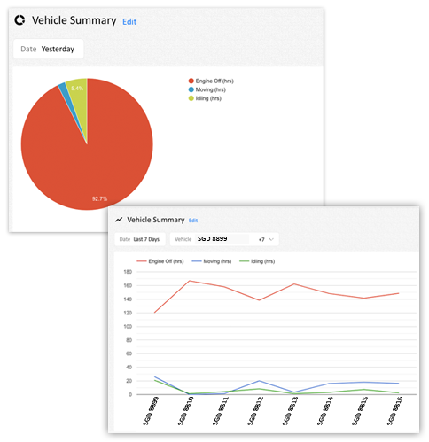
Pie Chart
Pie charts are visually simpler than other types of charts. It lets you compare data at a glance and helps you analyse or understand information quickly.
Vehicle summary (pie and line chart)
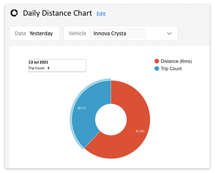
Donut View
Our improved ad-hoc report module lets you choose from the Normal or Donut view of Pie charts. Unlike normal Pie charts, Donut view displays categories as arcs rather than slices.
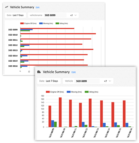
Bar and Column Chart
Using a bar chart or column chart lets you summarise large complex data into an easily understandable visual format.
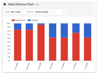
Bar or column charts can be used if you wish to compare data between fleets belonging to two different groups or to track changes over time. For example, if you wish to compare the fleet utilisation of two different Group viz., Sales and Delivery for the last 7 days, you may use the bar or column chart.
Vehicle summary (bar and column chart)
Stacked Chart
While Creating a bar or column chart, you may also opt to choose a stacked chart (option to choose from Don’t Stack, Stack and Stack – 100%) which lets you compare part-to-whole comparisons over time or across groups or categories, meaning; you can picturise the change over time.
Ceate your own chart
Create your own chart that provides you clear and concise information. Be it a chart based on the total distance covered by your fleets or the total fuel consumed for the day, you may customize the chart or choose from a list of prebuilt charts viz.,
- Vehicle Summary
- Distance – Fuel Chart
- Time Speed Chart
- Fuel Level Chart
- Load Sensor Chart
- Temperature Chart
Creating a custom chart
To create your customised chart, follow the self-explanatory steps, choose from predefined templates and the most relevant fields.
Customisation allows you to create charts based on a combination of criteria that suits your information requirement, i.e., you can decide how you would like to display the relevant chart.
It lets you analyse data or information of your fleets and helps you make quick decisions and manage your fleets most efficiently.
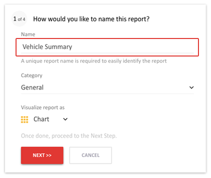
Name Your Report
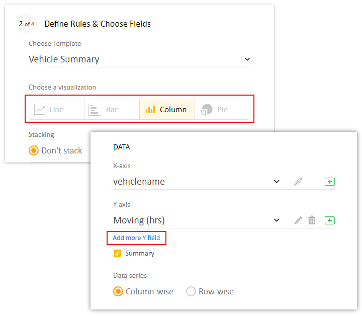
Define Rules & Choose Fields
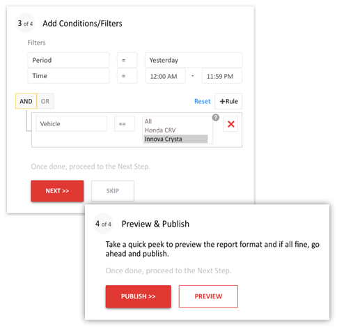
Add Conditions/Filters and Publish your report
You are good to go; Start creating your charts today and experience the difference in analysing your visual information.